Modernism in Web Design & Brand Identity
Posted in Expertise • 8 minute read
In the world of design, trends come and go, and styles evolve with the times. One design movement that has made a strong comeback in recent years is modernism. Originally popular in the early to mid-20th century, modernism embraced simplicity, minimalism and functionalism. In recent times, modernism has reemerged as a powerful aesthetic that resonates with contemporary audiences. In this insight, we’ll explore the return of modernism in web design and brand identity and why it has regained popularity.
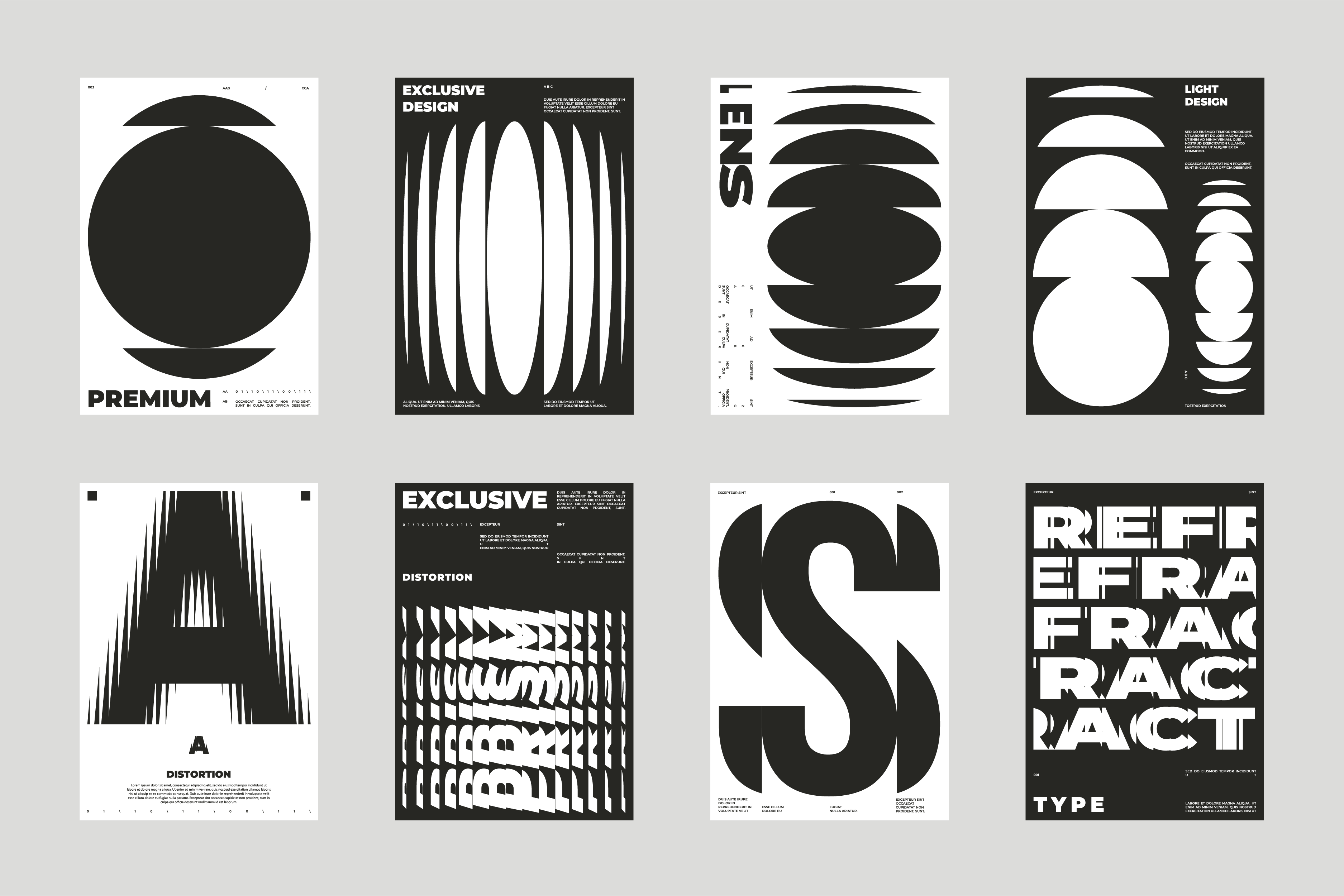
Simplicity and Minimalism
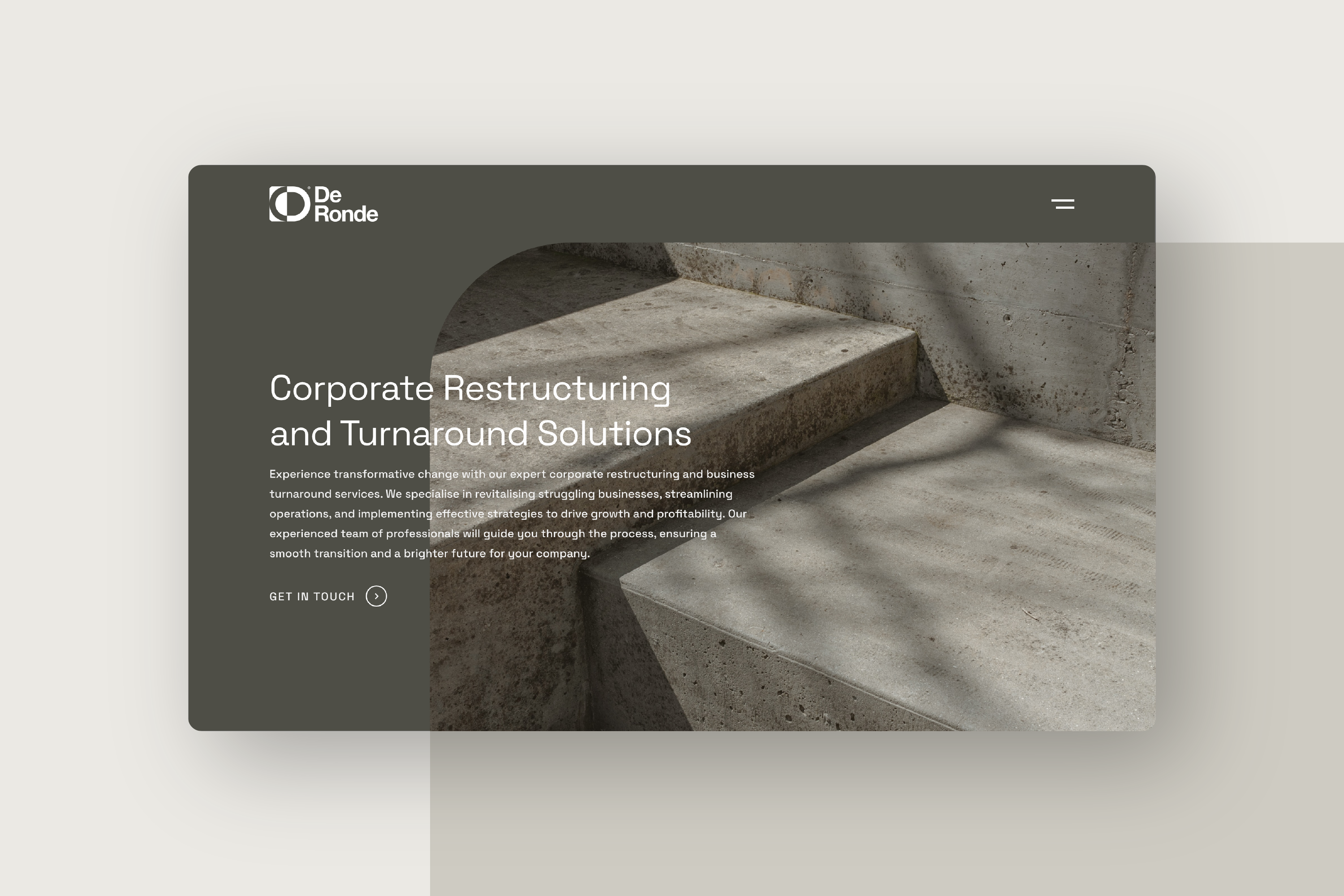
One of the core principles of modernism is simplicity: Modernist design favours clean lines, minimal ornamentation, and a focus on functionality. In a cluttered digital landscape, where users are bombarded with information, simple and minimalistic designs provide a breath of fresh air. By stripping away unnecessary elements, modernist-inspired websites and brand identities communicate a clear and concise message. The emphasis on simplicity allows for a more streamlined user experience and enhances the visual impact of the design. See our recent project for DeRonde where we applied these principles.

Typography and Grid Systems
Typography plays a crucial role in modernist design. Bold and geometric typefaces, often with sans-serif fonts, are commonly used to convey a sense of clarity and order. Modernist-inspired designs incorporate large, bold headlines and use typography as a visual element to create hierarchy and structure. Grid systems, another hallmark of modernism, help organise content and provide a sense of balance and harmony. The use of grids in web design allows for consistent spacing, alignment and a logical flow of information, contributing to an overall cohesive and visually appealing design.
Colour Palette
The colour palette in modernist design tends to be simple and restrained. Neutral colours such as black, white, grey, and muted tones are often used, creating a sense of sophistication and elegance. Occasionally, bold accent colours are introduced to add visual interest and draw attention to specific elements. The limited colour palette in modernist-inspired digital design creates a timeless aesthetic that can adapt to various contexts and maintain visual consistency.
Functionality and User Experience
Modernist Inspired design places a strong emphasis on functionality and user experience. Clean layouts, intuitive navigation and clear calls to action are essential elements of modern-day websites. By focusing on usability and ensuring that the design serves a purpose, modernism aligns with the user-centered approach that is prevalent in contemporary web and user interface design. The streamlined and functional nature of this enhances the overall user experience, making it easier for visitors to navigate and engage with the website.
Brand Identity and Visual Consistency
Modernism’s emphasis on simplicity and minimalism lends itself well to creating strong brand identities. By applying modernist design principles to branding, businesses can establish a visual identity that is clean, cohesive, and memorable. Consistency in visual elements such as logos, typography, and colour palette across different touchpoints creates a strong brand presence and builds brand recognition.
See our recent modernist-inspired project for DeRonde which we feel exudes a sense of professionalism, reliability, and sophistication, all of which are highly valued by DeRonde’s target audience.

The resurgence of modernism signifies a shift towards a more refined and purposeful approach to how we design. In an era of information overload, digital designs should now offer clarity, simplicity, and functionality. By embracing the principles of modernism, we create visually striking and user-friendly websites and strong brand identities that resonate with contemporary audiences.